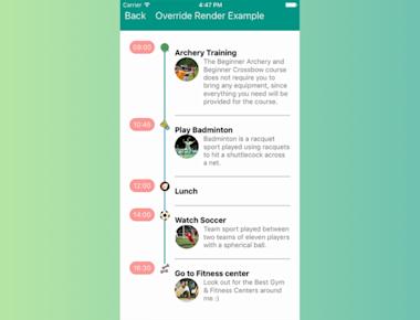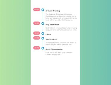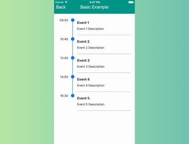
Basic Timeline Listview
April 15, 2023
1 min
Timeline component for React Native App work for Android and iOS
| Property | Type | Default | Description |
|---|---|---|---|
| time | string | null | event time |
| title | string | null | event title |
| description | string | null | event description |
| lineWidth | int | same as lineWidth of ‘Timeline’ | event line width |
| lineColor | string | same as lineColor of ‘Timeline’ | event line color |
| circleSize | int | same as circleSize of ‘Timeline’ | event circle size |
| circleColor | string | same as circleColor of ‘Timeline’ | event circle color |
| dotColor | string | same as dotColor of ‘Timeline’ | event dot color (innerCircle = ‘dot’) |
| icon | obj(image source) | same as icon of ‘Timeline’ | event icon (innerCircle = ‘color’) |
| Property | Type | Default | Description |
|---|---|---|---|
| data | data object | null | timeline data |
| innerCircle | string | null | timeline mode : ‘none’, ‘dot’, ‘icon’ |
| separator | bool | true | render separator line of events |
| columnFormat | string | ‘single-left’ | can be ‘single-column-left’, ‘single-column-right’, ‘two-column’ |
| lineWidth | int | 2 | timeline line width |
| lineColor | string | ‘#007AFF’ | timeline line color |
| circleSize | int | 16 | timeline circle size |
| circleColor | string | ‘#007AFF’ | timeline circle color |
| dotColor | string | ‘white’ | timeline dot color (innerCircle = ‘dot’) |
| icon | obj(image source) | null | timeline icon (innerCircle = ‘color’) |
| style | object | null | custom styles of Timeline container |
| listViewStyle | object | null | custom styles of inner ListView |
| timeStyle | object | null | custom styles of event time |
| titleStyle | object | null | custom styles of event title |
| descriptionStyle | object | null | custom styles of event description |
| iconStyle | object | null | custom styles of event icon |
| separatorStyle | object | null | custom styles of separator |
| rowContainerStyle | object | null | custom styles of event container |
| timeContainerStyle | object | null | custom styles of container of event time |
| detailContainerStyle | object | null | custom styles of container of event title and event description |
| onEventPress | function(event) | null | function to be invoked when event was pressed |
| renderTime | function(rowData, sectionID, rowID) | null | custom render event time |
| renderDetail | function(rowData, sectionID, rowID) | null | custom render event title and event description |
| renderCircle | function(rowData, sectionID, rowID) | null | custom render circle |
| renderFullLine | bool | false | render event border on last timeline item |
| options | object | null | ListView properties |
| showTime | boolean | true | Time container options |
npm i react-native-timeline-listview --save
import React, { Component } from 'react';
import { StyleSheet, View,Image,Text } from 'react-native';
import Timeline from 'react-native-timeline-flatlist';

export default class App extends Component {
  constructor(props) {
    super(props);
    this.data = [
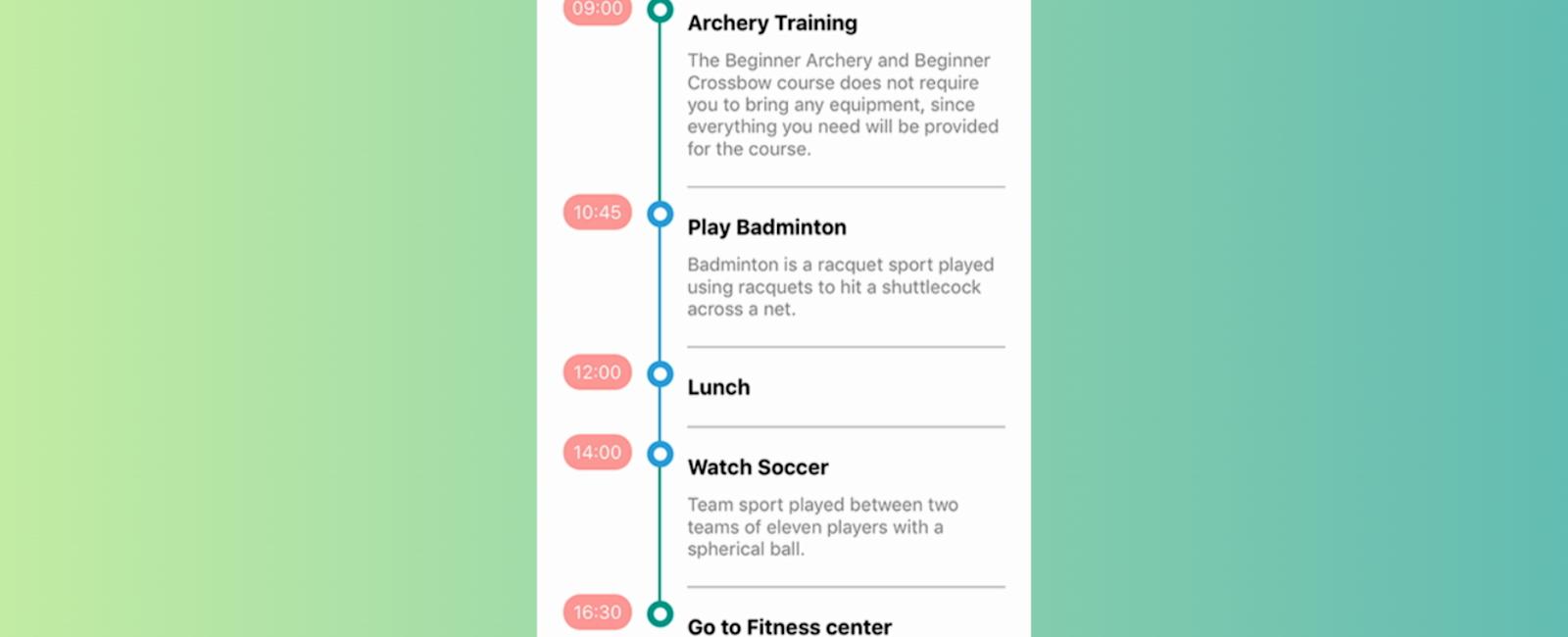
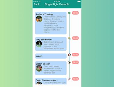
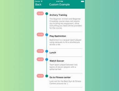
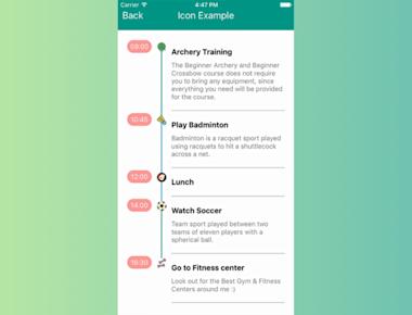
     {time: '09:00', title: 'Archery Training', description: 'The Beginner Archery and Beginner Crossbow course does not require you to bring any equipment, since everything you need will be provided for the course. ',lineColor:'#009688'},
      {time: '10:45', title: 'Play Badminton', description: 'Badminton is a racquet sport played using racquets to hit a shuttlecock across a net.'},
      {time: '12:00', title: 'Lunch', },
      {time: '14:00', title: 'Watch Soccer', description: 'Team sport played between two teams of eleven players with a spherical ball. ',lineColor:'#009688'},
      {time: '16:30', title: 'Go to Fitness center', description: 'Look out for the Best Gym & Fitness Centers around me :)'}
    ];
  }

  render() {
    return (
      <View style={styles.container}>
        <Timeline
          style={styles.list}
          data={this.data}
          circleSize={20}
          circleColor='rgb(45,156,219)'
          lineColor='rgb(45,156,219)'
          timeContainerStyle={{minWidth:52, marginTop: -5}}
          timeStyle={{textAlign: 'center', backgroundColor:'#ff9797', color:'white', padding:5, borderRadius:13}}
          descriptionStyle={{color:'gray'}}
          options={{
            style:{paddingTop:5}
          }}
          innerCircle={'dot'}
        />
      </View>
    );
  }
}

const styles = StyleSheet.create({
  container: {
    flex: 1,
    padding: 20,
  paddingTop:65,
    backgroundColor:'white'
  },
  list: {
    flex: 1,
    marginTop:20,
  },
  title:{
    fontSize:16,
    fontWeight: 'bold'
  },
  descriptionContainer:{
    flexDirection: 'row',
    paddingRight: 50
  },
  image:{
    width: 50,
    height: 50,
    borderRadius: 25
  },
  textDescription: {
    marginLeft: 10,
    color: 'black'
  }
});
Coming Soon…
Quick Links
Legal Stuff
