Dropdown Modal

Table Of Contents
Introduction
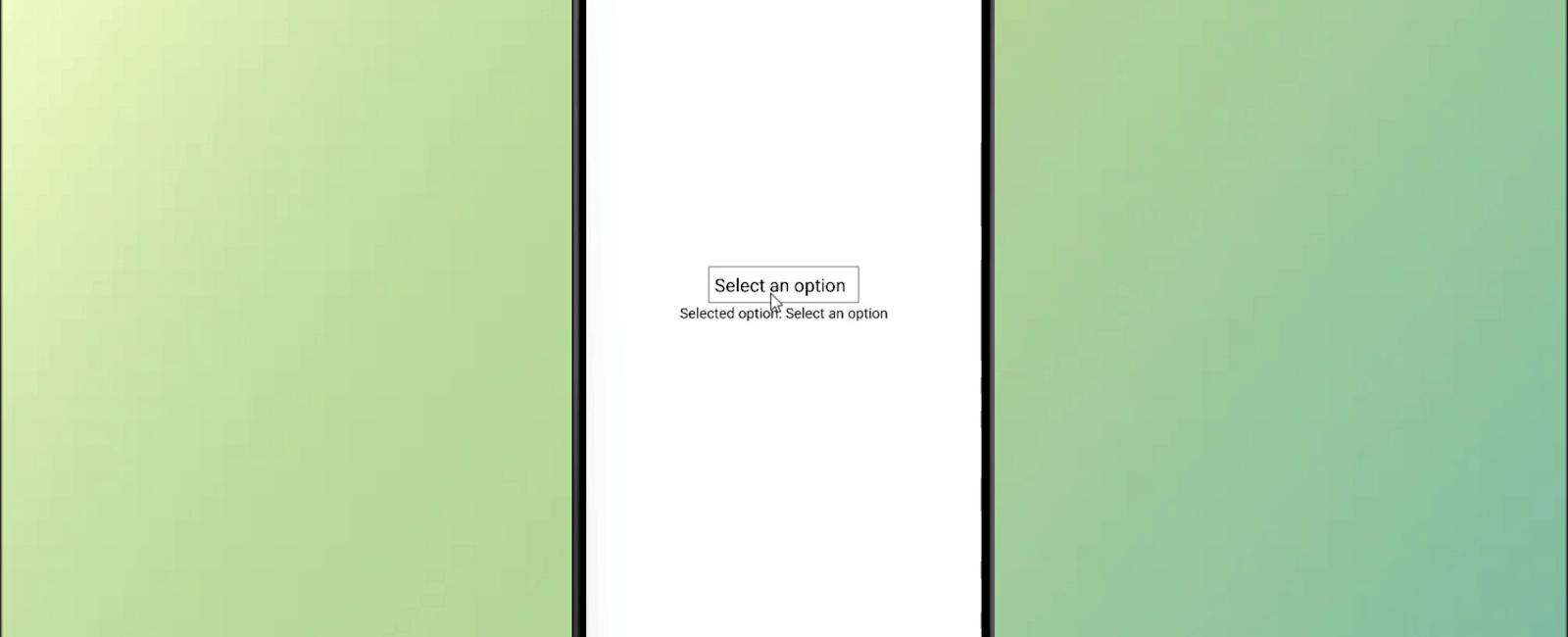
React Native Modal Dropdown is a popular component library for React Native that allows you to implement a dropdown menu in your app. The dropdown menu is implemented as a modal, which means that it appears on top of the rest of your app’s content and allows users to select an option from a list. The component is highly customizable, with options for changing the appearance of the dropdown, the dropdown’s items, and the text style of the selected option. Additionally, the component provides several callbacks, such as onSelect, which allow you to handle events, such as when an option is selected. Overall, React Native Modal Dropdown is a useful component for adding dropdown menus to your React Native app, with a simple and straightforward implementation.
Installation
npm i react-native-modal-dropdown -save
Example
import React, { useState } from 'react';
import { View, Text, TouchableOpacity, StyleSheet } from 'react-native';
import ModalDropdown from 'react-native-modal-dropdown';

const App = () => {
  const [selectedOption, setSelectedOption] = useState('Select an option');

  const options = [
    'Option 1',
    'Option 2',
    'Option 3',
    'Option 4',
    'Option 5',
  ];

  const handleOptionSelect = (index, value) => {
    setSelectedOption(value);
  };

  return (
    <View style={styles.container}>
      <ModalDropdown
        options={options}
        defaultValue={selectedOption}
        onSelect={handleOptionSelect}
        style={styles.dropdown}
        textStyle={styles.dropdownText}
        dropdownStyle={styles.dropdownDropdown}
        dropdownTextStyle={styles.dropdownDropdownText}
      />
      <Text>Selected option: {selectedOption}</Text>
    </View>
  );
};

const styles = StyleSheet.create({
  container: {
    flex: 1,
    justifyContent: 'center',
    alignItems: 'center',
  },
  dropdown: {
    width: 150,
    borderWidth: 1,
    borderColor: 'gray',
    padding: 5,
  },
  dropdownText: {
    fontSize: 18,
  },
  dropdownDropdown: {
    width: 150,
    height: 200,
    borderColor: 'gray',
    borderWidth: 1,
  },
  dropdownDropdownText: {
    fontSize: 18,
  },
});

export default App;
Tutorial
Coming Soon…
Related Posts


Quick Links
Legal Stuff

