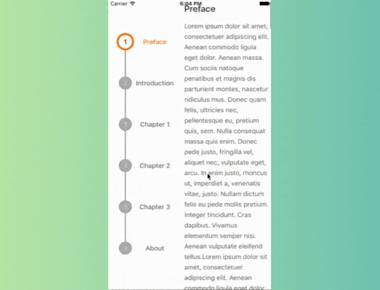
Vertical Step indicator
May 06, 2023
1 min
Lightbox is Shoutem’s fork of react-native-lightbox component. All content within Lightbox is transformable, meaning it can be pinched to zoom, panned (translated), etc.
npm install --save react-native-lightbox
import React, { Component } from 'react';

import { StyleSheet, ScrollView, Text, Image, View } from 'react-native';

import Lightbox from 'react-native-lightbox';

export default class App extends Component {

  render() {
    return (

      <ScrollView style={styles.container} >

          <View style={styles.text}>
            <Text>Hello Guys, Welcome to ReactNativeCode.com, Today we are going to learn about Lightbox in React Native. </Text>
          </View>

          <Lightbox underlayColor="white">
            <Image
              style={styles.contain}
              resizeMode="contain"
              source={{ uri: 'https://reactnativecode.com/wp-content/uploads/2017/06/sample_image.png' }}
            />
          </Lightbox>

        </ScrollView>

    );
  }
}

const styles = StyleSheet.create({
  container: {
    paddingHorizontal: 20,
  },
  contain: {
    flex: 1,
    height: 200,
  },
  text: {
    marginVertical: 20,
    textAlign: 'center'
  },
});
| Prop | Type | Description |
|---|---|---|
activeProps | object | Optional set of props applied to the content component when in lightbox mode. Usable for applying custom styles or higher resolution image source. |
renderHeader(close) | function | Custom header instead of default with X button |
renderContent | function | Custom lightbox content instead of default child content |
willClose | function | Triggered before lightbox is closed |
onClose | function | Triggered when lightbox is closed |
onOpen | function | Triggered when lightbox is opened |
didOpen | function | Triggered after lightbox is opened |
underlayColor | string | Color of touchable background, defaults to black |
backgroundColor | string | Color of lightbox background, defaults to black |
swipeToDismiss | bool | Enables gestures to dismiss the fullscreen mode by swiping up or down, defaults to true. |
springConfig | object | Animated.spring configuration, defaults to { tension: 30, friction: 7 }. |
Quick Links
Legal Stuff
