
Local List Auto Complete

Table Of Contents
Introduction
React Native Autocomplete is a library that allows users to easily create an autocomplete input field in their React Native app. Autocomplete is a feature that can be useful for many types of applications, especially those that rely heavily on user input, such as search engines or e-commerce apps.
With the React Native Autocomplete library, developers can create an input field that will display a list of suggested values based on the user’s input. This can be done by simply passing an array of options to the Autocomplete component. The user’s input is then matched against the options, and a list of matches is displayed.
The Autocomplete component also allows for customization of the suggestion list, including custom rendering of individual options and the ability to limit the number of options displayed at once. Overall, React Native Autocomplete is a powerful and flexible library that can help developers create more user-friendly and efficient input fields in their React Native apps.
Events
| event | Info |
|---|---|
| onTyping | Text is entered. The callback can be delayed with option autoCompleteFetchRequestDelay. |
| onSelect | A cell in the suggestions list is selected. |
| onFocus | Text input get focus. |
| onBlur | Text input lost focus. |
Other events from Text Input are avalaible.
Global options
| option | type | Info |
|---|---|---|
| cellComponent | string | Name of a React Native component used to render cells. If null, use the default rendering. |
| suggestions | array | If using default cell rendering specify an Array of string, otherwise any object. |
| autoCompleteFetchRequestDelay | number | Delay in milliseconds before retrieving suggestions. |
| maximumNumberOfAutoCompleteRows | number | Number of suggestions displayed. |
| showTextFieldDropShadowWhenAutoCompleteTableIsOpen | bool | Display a drop shadow around the text field. |
| autoCompleteTableViewHidden | bool | If true, the suggestions list will be hidden. |
| autoCompleteTableBorderColor | color | Set suggestions list border color. |
| autoCompleteTableBorderWidth | number | Set suggestions list border color. |
| autoCompleteTableBackgroundColor | color | Set suggestions list border size. |
| autoCompleteTableCornerRadius | number | Set suggestions list background color. |
| autoCompleteTableTopOffset | number | Set the distance between the text field and the suggestions list. |
| autoCompleteTableLeftOffset | number | Set the left offset between the container and the suggestions list. |
| autoCompleteTableSizeOffset | number | Set the offset of the suggestions list size. Combined with autoCompleteTableLeftOffset, you can reduce the width of the suggestions list and to center it. Exemple: autoCompleteTableLeftOffset=20 autoCompleteTableSizeOffset=40 |
| autoCompleteRowHeight | number | Height of cells in the suggestions list. |
Default cell rendering options
| option | type | Info |
|---|---|---|
| autoCompleteFontSize | number | Font Size used to display text. |
| autoCompleteRegularFontName | string | Font used to display text. |
| autoCompleteBoldFontName | string | Font used to display suggestion text. |
| autoCompleteTableCellTextColor | color | Text Color used to display text. |
| autoCompleteTableCellBackgroundColor | color | Background color of cells. |
| applyBoldEffectToAutoCompleteSuggestions | bool | If false, disable bold effect on suggestion text. |
| reverseAutoCompleteSuggestionsBoldEffect | bool | Reverse the bold effect. |
Installation
npm install react-native-autocomplete
Example
import React, { memo, useState } from 'react'
import { Text, View, SafeAreaView,
  ScrollView,  StatusBar,  StyleSheet,  useColorScheme,  Platform, KeyboardAvoidingView,} from 'react-native'
import { AutocompleteDropdown } from 'react-native-autocomplete-dropdown'

export const LocalDataSetExample = memo(() => {
  const [selectedItem, setSelectedItem] = useState(null)

  return (
    <SafeAreaView style={{ flex: 1 }}>
      <StatusBar barStyle={'light-content'} />
      <KeyboardAvoidingView
        style={{ flex: 1 }}
        behavior={Platform.OS === 'ios' ? 'padding' : 'height'}
        enabled>

        <ScrollView
          nestedScrollEnabled
          keyboardDismissMode="on-drag"
          keyboardShouldPersistTaps="handled"
          contentInsetAdjustmentBehavior="automatic"
          contentContainerStyle={{ paddingBottom: 200 }}
          style={styles.scrollContainer}>
          <View style={[styles.container]}>
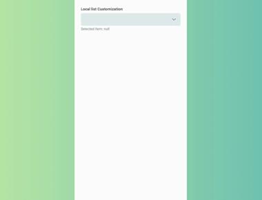
          <Text style={styles.sectionTitle}>Local list</Text>
            <AutocompleteDropdown
              clearOnFocus={false}
              closeOnBlur={true}
              initialValue={{ id: '2' }} // or just '2'
              onSelectItem={setSelectedItem}
              dataSet={[
                { id: '1', title: 'Alpha' },
                { id: '2', title: 'Beta' },
                { id: '3', title: 'Gamma' },
              ]}
            />
              <Text style={{ color: '#668', fontSize: 13 }}>Selected item: {JSON.stringify(selectedItem)}</Text>
          </View>
        </ScrollView>
      </KeyboardAvoidingView>
    </SafeAreaView>

  )
})

const styles = StyleSheet.create({
  scrollContainer: {
    flex: 1,
  },
  container: {
    padding: 20,
  },
  title: {
    textAlign: 'center',
    fontSize: 25,
    marginBottom: 50,
  },
  section: {
    marginBottom: 40,
  },
  sectionTitle: {
    fontWeight: 'bold',
    marginBottom: 3,
  },
})

export default LocalDataSetExample;
Tutorial
Coming Soon…
Tags
Related Posts


Quick Links
Legal Stuff

