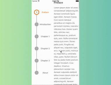
Vertical Step indicator
May 06, 2023
1 min
React Native Pulse Loader is a library that provides animated pulse loaders for React Native applications. It is a simple and lightweight library that helps developers create loading animations that can be used to improve user experience.
In this blog post, we will discuss how to use React Native Pulse Loader in your application. We will cover installation, usage, and customization of the library.
Here are the props available for the react-native-pulse-loader component:
| Property | Type | Default | Description |
|---|---|---|---|
| interval | number | 2000 | action buttons visible or not |
| size | number | 100 | width and height of the avatar |
| pulseMaxSize | number | 250 | maximum size of the pulse in the background |
| avatar | string | undefined | required avatar url to display |
| pressInValue | number | 0.8 | should be between 0 and 1. scale of the avatar, when pressed in |
| pressDuration | number | 150 | duration of the scale animation |
| pressInEasing | Easing | Easing.in | easing type of the press in animation |
| pressOutEasing | Easing | Easing.out | easing type of the press out animation |
| borderColor | string | ‘#D8335B’ | border color of the pulse |
| backgroundColor | string | ‘#ED225B55’ | background color of the pulse |
| getStyle | function | undefined | override the styling of the pulse. gets as parameter the Animated variable. e.g. (anim) => ({ backgroundColor: ‘yellow’ }) |
npm install react-native-pulse-loader
Or
yarn add react-native-pulse-loader
import React, { useState, useEffect } from 'react';
import { View, Text, StyleSheet, Animated, Image } from 'react-native';
import Pulse from 'react-native-pulse';

const App = () => {
  const [pulseScale, setPulseScale] = useState(new Animated.Value(1));
  const [pulseOpacity, setPulseOpacity] = useState(new Animated.Value(1));

  useEffect(() => {
    const pulseAnimation = Animated.loop(
      Animated.parallel([
        Animated.timing(pulseScale, {
          toValue: 3,
          duration: 3000,
          useNativeDriver: false,
        }),
        Animated.timing(pulseOpacity, {
          toValue: 0,
          duration: 3000,
          useNativeDriver: false,
        }),
      ]),
    );
    pulseAnimation.start();

    return () => {
      pulseAnimation.stop();
    };
  }, [pulseScale, pulseOpacity]);

  return (
    <View style={styles.container}>
      <Pulse
        color="#8e44ad"
        avatar={'https://scontent-fra3-1.cdninstagram.com/t51.2885-15/e35/11429705_386886401514376_550879228_n.jpg'}
        numPulses={3}
        diameter={400}
        speed={8}
        duration={2000}
        {...{ pulseScale, pulseOpacity }}
      />
      <Image
          source={{ uri: 'https://img.freepik.com/premium-vector/cute-cat-spilled-coffee-cup-cartoon-vector-icon-illustration-animal-drink-icon-concept-isolated_138676-5400.jpg?w=740' }}
          style={{
            position: 'absolute',
            top: '50%',
            left: '50%',
            transform: [{ translateX: -50 }, { translateY: -50 }],
            width: 100,
            height: 100,
            borderRadius: 50,
            borderWidth: 5,
            borderColor: '#fff',
          }}
        />
    </View>
  );
};

const styles = StyleSheet.create({
  container: {
    flex: 1,
    justifyContent: 'center',
    alignItems: 'center',
    backgroundColor: '#ecf0f1',
  }
});

export default App;
Coming Soon…
Quick Links
Legal Stuff


