Simple Recycler-List-View
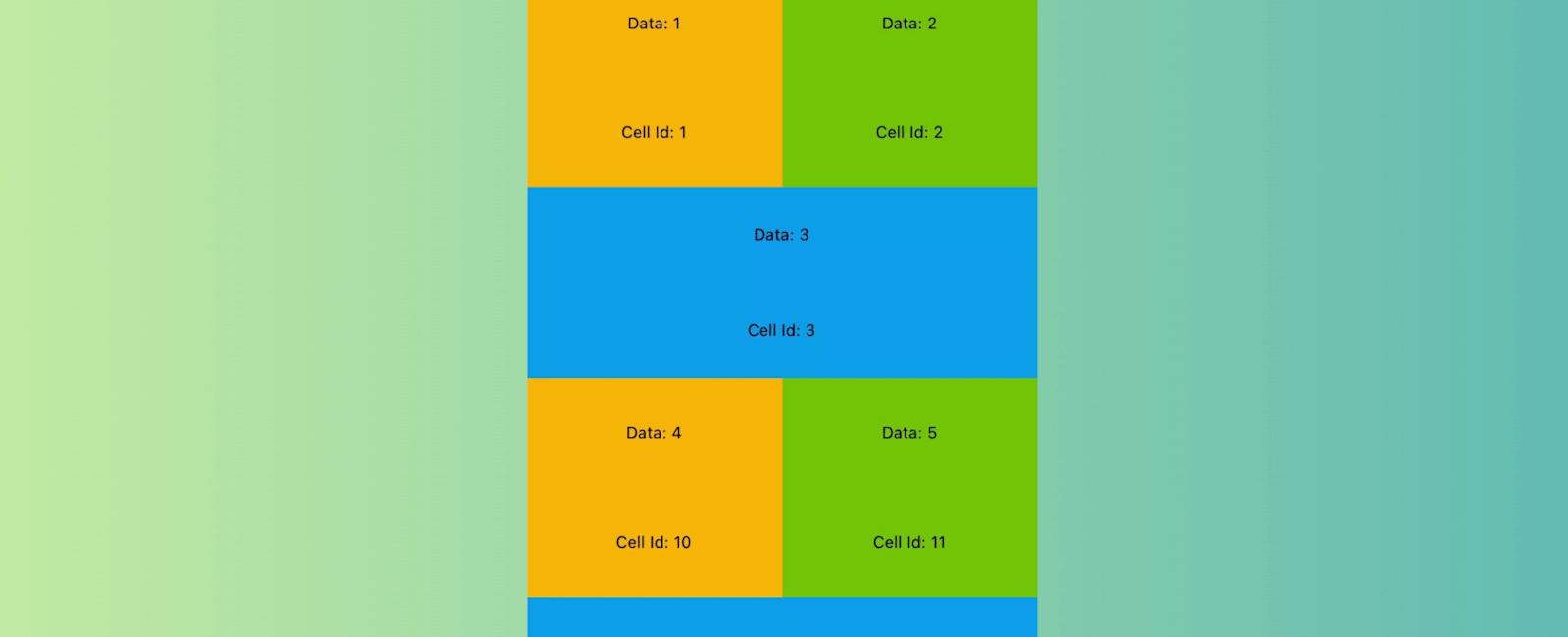
Table Of Contents
Introduction
RecyclerListView uses “cell recycling” to reuse views that are no longer visible to render items instead of creating new view objects. Creation of objects is very expensive and comes with a memory overhead which means as you scroll through the list the memory footprint keeps going up. Releasing invisible items off memory is another technique but that leads to creation of even more objects and lot of garbage collections. Recycling is the best way to render infinite lists that does not compromise performance or memory efficiency.
Apart from all performance benefits RecyclerListView comes with great features out of the box:
- Cross Platform, works on Web
- Supports staggered grid layouts
- Supports variable height items even if dimensions cannot be predetermined (prop -
forceNonDeterministicRendering) - Instant layout switching like going from GridView to ListView and vice versa
- End reach detections
- Horizontal Mode
- Viewability Events
- Initial render offset/index support
- Footer support
- Reflow support on container size change with first visible item preservation
- Scroll position preservation
- Window scrolling support for web
- (New) ItemAnimator interface added, customize to your will how RLV handles layout changes. Allows you to modify animations that move cells. You can do things like smoothly move an item to a new position when heightof one of the cells has changed.
- (New) Stable Id support, ability to associate a stable id with an item. Will enable beautiful add/remove animations and optimize re-renders when DataProvider is updated.
- (New) Sticky recycler items that stick to either the top or bottom.
Props
| Prop | Required | Params Type | Description |
|---|---|---|---|
| layoutProvider | Yes | BaseLayoutProvider | Constructor function that defines the layout (height / width) of each element |
| dataProvider | Yes | DataProvider | Constructor function the defines the data for each element |
| contextProvider | No | ContextProvider | Used to maintain scroll position in case view gets destroyed, which often happens with back navigation |
| rowRenderer | Yes | (type: string | number, data: any, index: number) => JSX.Element | JSX.Element[] | null | Method that returns react component to be rendered. You get the type, data, index and extendedState of the view in the callback |
| initialOffset | No | number | Initial offset you want to start rendering from; This is very useful if you want to maintain scroll context across pages. |
| renderAheadOffset | No | number | specify how many pixels in advance you want views to be rendered. Increasing this value can help reduce blanks (if any). However, keeping this as low as possible should be the intent. Higher values also increase re-render compute |
| isHorizontal | No | boolean | If true, the list will operate horizontally rather than vertically |
| onScroll | No | rawEvent: ScrollEvent, offsetX: number, offsetY: number) => void | On scroll callback function that executes as a user scrolls |
| onRecreate | No | (params: OnRecreateParams) => void | callback function that gets executed when recreating the recycler view from context provider |
| externalScrollView | No | { new (props: ScrollViewDefaultProps): BaseScrollView } | Use this to pass your on implementation of BaseScrollView |
| onEndReached | No | () => void | Callback function executed when the end of the view is hit (minus onEndThreshold if defined) |
| onEndReachedThreshold | No | number | Specify how many pixels in advance for the onEndReached callback |
| onEndReachedThresholdRelative | No | number | Specify how far from the end (in units of visible length of the list) the bottom edge of the list must be from the end of the content to trigger the onEndReached callback |
| onVisibleIndicesChanged | No | TOnItemStatusChanged | Provides visible index; helpful in sending impression events |
| onVisibleIndexesChanged | No | TOnItemStatusChanged | (Deprecated in 2.0 beta) Provides visible index; helpful in sending impression events |
| renderFooter | No | () => JSX.Element | JSX.Element[] | null | Provide this method if you want to render a footer. Helpful in showing a loader while doing incremental loads |
| initialRenderIndex | No | number | Specify the initial item index you want rendering to start from. Preferred over initialOffset if both specified |
| scrollThrottle | No | number | iOS only; Scroll throttle duration |
| canChangeSize | No | boolean | Specify if size can change |
| distanceFromWindow | No | number | (Depricated) Use applyWindowCorrection() API with windowShift. Usage? |
| applyWindowCorrection | No | (offset: number, windowCorrection: WindowCorrection) => void | (Enhancement/replacement to distanceFromWindow API) Allows updation of the visible windowBounds to based on correctional values passed. User can specify windowShift; in case entire RecyclerListWindow needs to shift down/up, startCorrection; in case when top window bound needs to be shifted for e.x. top window bound to be shifted down is a content overlapping the top edge of RecyclerListView, endCorrection: to alter bottom window bound for a similar use-case. Usage? |
| useWindowScroll | No | boolean | Web only; Layout Elements in window instead of a scrollable div |
| disableRecycling | No | boolean | Turns off recycling |
| forceNonDeterministicRendering | No | boolean | Default is false; if enabled dimensions provided in layout provider will not be strictly enforced. Use this if item dimensions cannot be accurately determined |
| extendedState | No | object | In some cases the data passed at row level may not contain all the info that the item depends upon, you can keep all other info outside and pass it down via this prop. Changing this object will cause everything to re-render. Make sure you don’t change it often to ensure performance. Re-renders are heavy. |
| itemAnimator | No | ItemAnimator | Enables animating RecyclerListView item cells (shift, add, remove, etc) |
| style | No | object | To pass down style to inner ScrollView |
| scrollViewProps | No | object | For all props that need to be proxied to inner/external scrollview. Put them in an object and they’ll be spread and passed down. |
| layoutSize | No | Dimension | Will prevent the initial empty render required to compute the size of the listview and use these dimensions to render list items in the first render itself. This is useful for cases such as server side rendering. The prop canChangeSize has to be set to true if the size can be changed after rendering. Note that this is not the scroll view size and is used solely for layouting. |
| onItemLayout | No | number | A callback function that is executed when an item of the recyclerListView (at an index) has been layout. This can also be used as a proxy to itemsRendered kind of callbacks. |
| windowCorrectionConfig | No | object | Used to specify is window correction config and whether it should be applied to some scroll events |
For full feature set have a look at prop definitions of RecyclerListView
(bottom of the file). All ScrollView features like RefreshControl also work out of the box.
applyWindowCorrection usage
applyWindowCorrection is used to alter the visible window bounds of the RecyclerListView dynamically. The windowCorrection of RecyclerListView along with the current scroll offset are exposed to the user. The windowCorrection object consists of 3 numeric values:
windowShift- Direct replacement ofdistanceFromWindowparameter. Window shift is the offset value by which the RecyclerListView as a whole is displaced within the StickyContainer, use this param to specify how far away the first list item is from window top. This value corrects the scroll offsets for StickyObjects as well as RecyclerListView.startCorrection- startCorrection is used to specify the shift in the top visible window bound, with which user can receive the correct Sticky header instance even when an external factor like CoordinatorLayout toolbar.endCorrection- endCorrection is used to specify the shift in the bottom visible window bound, with which user can receive correct Sticky Footer instance when an external factor like bottom app bar is changing the visible view bound.
Installation
npm install --save recyclerlistview
For latest beta:
npm install --save recyclerlistview@beta```

# Example

```js
/***
 Use this component inside your React Native Application.
 A scrollable list with different item type
 */
import React, { Component } from "react";
import { View, Text, Dimensions } from "react-native";
import { RecyclerListView, DataProvider, LayoutProvider } from "recyclerlistview";

const ViewTypes = {
    FULL: 0,
    HALF_LEFT: 1,
    HALF_RIGHT: 2
};

let containerCount = 0;

class CellContainer extends React.Component {
    constructor(args) {
        super(args);
        this._containerId = containerCount++;
    }
    render() {
        return <View {...this.props}>{this.props.children}<Text>Cell Id: {this._containerId}</Text></View>;
    }
}

/***
 * To test out just copy this component and render in you root component
 */
export default class RecycleTestComponent extends React.Component {
    constructor(args) {
        super(args);

        let { width } = Dimensions.get("window");

        //Create the data provider and provide method which takes in two rows of data and return if those two are different or not.
        //THIS IS VERY IMPORTANT, FORGET PERFORMANCE IF THIS IS MESSED UP
        let dataProvider = new DataProvider((r1, r2) => {
            return r1 !== r2;
        });

        //Create the layout provider
        //First method: Given an index return the type of item e.g ListItemType1, ListItemType2 in case you have variety of items in your list/grid
        //Second: Given a type and object set the exact height and width for that type on given object, if you're using non deterministic rendering provide close estimates
        //If you need data based check you can access your data provider here
        //You'll need data in most cases, we don't provide it by default to enable things like data virtualization in the future
        //NOTE: For complex lists LayoutProvider will also be complex it would then make sense to move it to a different file
        this._layoutProvider = new LayoutProvider(
            index => {
                if (index % 3 === 0) {
                    return ViewTypes.FULL;
                } else if (index % 3 === 1) {
                    return ViewTypes.HALF_LEFT;
                } else {
                    return ViewTypes.HALF_RIGHT;
                }
            },
            (type, dim) => {
                switch (type) {
                    case ViewTypes.HALF_LEFT:
                        dim.width = width / 2;
                        dim.height = 160;
                        break;
                    case ViewTypes.HALF_RIGHT:
                        dim.width = width / 2;
                        dim.height = 160;
                        break;
                    case ViewTypes.FULL:
                        dim.width = width;
                        dim.height = 140;
                        break;
                    default:
                        dim.width = 0;
                        dim.height = 0;
                }
            }
        );

        this._rowRenderer = this._rowRenderer.bind(this);

        //Since component should always render once data has changed, make data provider part of the state
        this.state = {
            dataProvider: dataProvider.cloneWithRows(this._generateArray(300))
        };
    }

    _generateArray(n) {
        let arr = new Array(n);
        for (let i = 0; i < n; i++) {
            arr[i] = i;
        }
        return arr;
    }

    //Given type and data return the view component
    _rowRenderer(type, data) {
        //You can return any view here, CellContainer has no special significance
        switch (type) {
            case ViewTypes.HALF_LEFT:
                return (
                    <CellContainer style={styles.containerGridLeft}>
                        <Text>Data: {data}</Text>
                    </CellContainer>
                );
            case ViewTypes.HALF_RIGHT:
                return (
                    <CellContainer style={styles.containerGridRight}>
                        <Text>Data: {data}</Text>
                    </CellContainer>
                );
            case ViewTypes.FULL:
                return (
                    <CellContainer style={styles.container}>
                        <Text>Data: {data}</Text>
                    </CellContainer>
                );
            default:
                return null;
        }
    }

    render() {
        return <RecyclerListView layoutProvider={this._layoutProvider} dataProvider={this.state.dataProvider} rowRenderer={this._rowRenderer} />;
    }
}
const styles = {
    container: {
        justifyContent: "space-around",
        alignItems: "center",
        flex: 1,
        backgroundColor: "#00a1f1"
    },
    containerGridLeft: {
        justifyContent: "space-around",
        alignItems: "center",
        flex: 1,
        backgroundColor: "#ffbb00"
    },
    containerGridRight: {
        justifyContent: "space-around",
        alignItems: "center",
        flex: 1,
        backgroundColor: "#7cbb00"
    }
};
Tutorial
Coming Soon…
Related Posts

Quick Links
Legal Stuff

