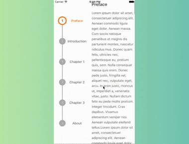
Vertical Step indicator
May 06, 2023
1 min
A pure JavaScript Slider component for react-native. This is still very much a work in progress, ideas and contributions are very welcome.
| Prop | Type | Optional | Default | Description |
|---|---|---|---|---|
| value | number | Yes | 0 | Initial value of the slider |
| disabled | bool | Yes | false | If true the user won’t be able to move the slider |
| minimumValue | number | Yes | 0 | Initial minimum value of the slider |
| maximumValue | number | Yes | 1 | Initial maximum value of the slider |
| step | number | Yes | 0 | Step value of the slider. The value should be between 0 and maximumValue - minimumValue) |
| minimumTrackTintColor | string | Yes | ‘#3f3f3f’ | The color used for the track to the left of the button |
| maximumTrackTintColor | string | Yes | ‘#b3b3b3’ | The color used for the track to the right of the button |
| thumbTintColor | string | Yes | ‘#343434’ | The color used for the thumb |
| thumbTouchSize | object | Yes | {width: 40, height: 40} | The size of the touch area that allows moving the thumb. The touch area has the same center as the visible thumb. This allows to have a visually small thumb while still allowing the user to move it easily. |
| onValueChange | function | Yes | Callback continuously called while the user is dragging the slider | |
| onSlidingStart | function | Yes | Callback called when the user starts changing the value (e.g. when the slider is pressed) | |
| onSlidingComplete | function | Yes | Callback called when the user finishes changing the value (e.g. when the slider is released) | |
| style | style | Yes | The style applied to the slider container | |
| trackStyle | style | Yes | The style applied to the track | |
| thumbStyle | style | Yes | The style applied to the thumb | |
| thumbImage | source | Yes | Sets an image for the thumb. | |
| debugTouchArea | bool | Yes | false | Set this to true to visually see the thumb touch rect in green. |
| animateTransitions | bool | Yes | false | Set to true if you want to use the default ‘spring’ animation |
| animationType | string | Yes | ‘timing’ | Set to ‘spring’ or ‘timing’ to use one of those two types of animations with the default animation properties. |
| animationConfig | object | Yes | undefined | Used to configure the animation parameters. These are the same parameters in the Animated library. |
import React, { useState } from 'react';
import { StyleSheet, View, Text, Slider } from 'react-native';

export default function App() {
  const [value, setValue] = useState(0);

  const handleChange = (newValue) => {
    setValue(newValue);
  };

  return (
    <View style={styles.container}>
      <Text style={styles.text}>Slider Value: {value.toFixed(2)}</Text>
      <Slider
        style={styles.slider}
        minimumValue={0}
        maximumValue={100}
        step={0.01}
        value={value}
        onValueChange={handleChange}
      />
    </View>
  );
}
Quick Links
Legal Stuff


