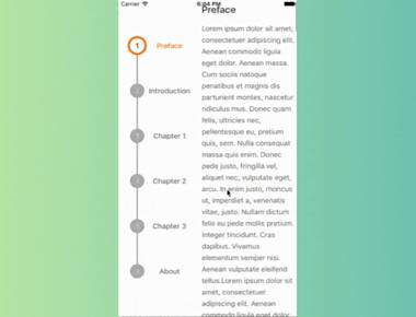
Vertical Step indicator
May 06, 2023
1 min
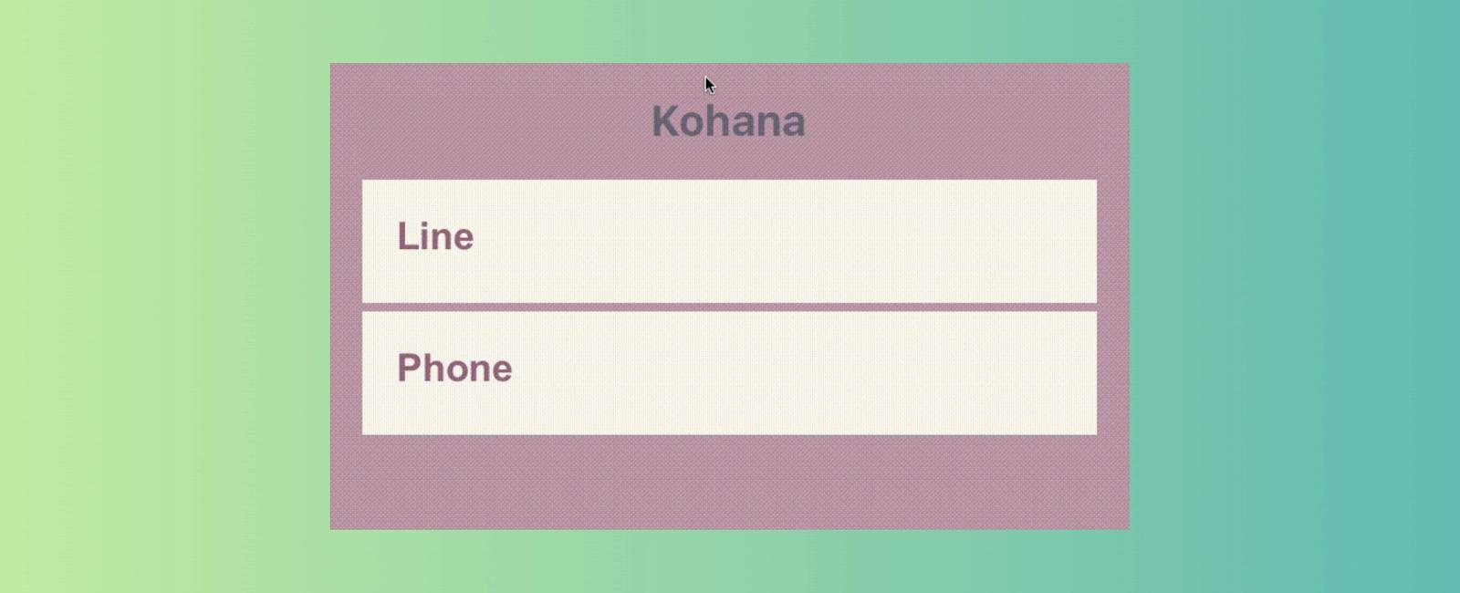
We’ve come across with those beautiful text inputs created and blogged by Codrops and wanted to port them to react-native. Some of those text fields are now ready to use in iOS and android thanks to react-native. There is also a native iOS library called TextFieldEffects which has built some of them in Swift.
| Prop | Type | Description |
|---|---|---|
label | String | Displayed as placeholder string of the input. |
style | View Style Object | Applied to the root container of the input. |
labelStyle | View Style Object | Applied to the container of the label view. |
inputStyle | Text Style Object | Applied to the TextInput component. |
value | String | This value will be applied to the TextInput and change it’s state on every render. Use this prop if you want a Controlled Component. |
defaultValue | String | If you want to initialize the component with a non-empty value, you can supply a defaultValue prop. This prop creates an Uncontrolled Component and is only used during initial render. |
You can also use default TextInput Props. They’ll be passed into TextInput component. E.g., use TextInput’s onChange prop to be notified on text changes.
<SaeonChangeText={(text) => { this.setState({textValue: text}) }/>
This component needs Icon component from react-native-vector-icons to operate with icons. You should import it before creating a TextInputEffects component.
import Icon from 'react-native-vector-icons/FontAwesome';
| Prop | Type | Description |
|---|---|---|
iconClass | Object | The Icon component class you’ve imported from react-native-vector-icons. |
iconName | String | Name of the icon that is passed to Icon component. |
iconColor | String | Applied to the Icon component. |
iconSize | Number | Applied to the Icon component. |
npm i react-native-vector-icons
npm install react-native-textinput-effects –save
Or
npm install react-native-textinput-effects@0.4.2 –save
import React from 'react';import { View } from 'react-native';import MaterialsIcon from 'react-native-vector-icons/MaterialIcons';import { Kohana } from 'react-native-textinput-effects';const MyComponent = () => {const KohanaInput = (<Kohanastyle={{ backgroundColor: 'white', height: 40 }} // Add height to reduce box heightlabel={'Bus Route'}inputHeight={40} // Adjust input height hereiconClass={MaterialsIcon}iconName={'directions-bus'}iconColor={'#f4d29a'}inputPadding={16}labelStyle={{ color: '#91627b' }}inputStyle={{ color: '#91627b' }}labelContainerStyle={{ padding: 20 }}iconContainerStyle={{ padding: 20 }}useNativeDriver/>);const KohanaInput1 = (<Kohanastyle={{ backgroundColor: '#f9f5ed', height: 40 }} // Add height to reduce box heightlabel={'Line'}iconClass={MaterialsIcon}iconName={'call'}iconColor={'#f4d29a'}inputPadding={16}labelStyle={{ color: '#91627b' }}inputStyle={{ color: '#91627b' }}labelContainerStyle={{ padding: 20 }}iconContainerStyle={{ padding: 20 }}useNativeDriverstyle={{ marginTop: 10 }}/>);return (<View style={{ flex: 1, padding: 50, backgroundColor: 'purple' }}>{KohanaInput}{KohanaInput1}</View>);};export default MyComponent;
Coming Soon…




Quick Links
Legal Stuff